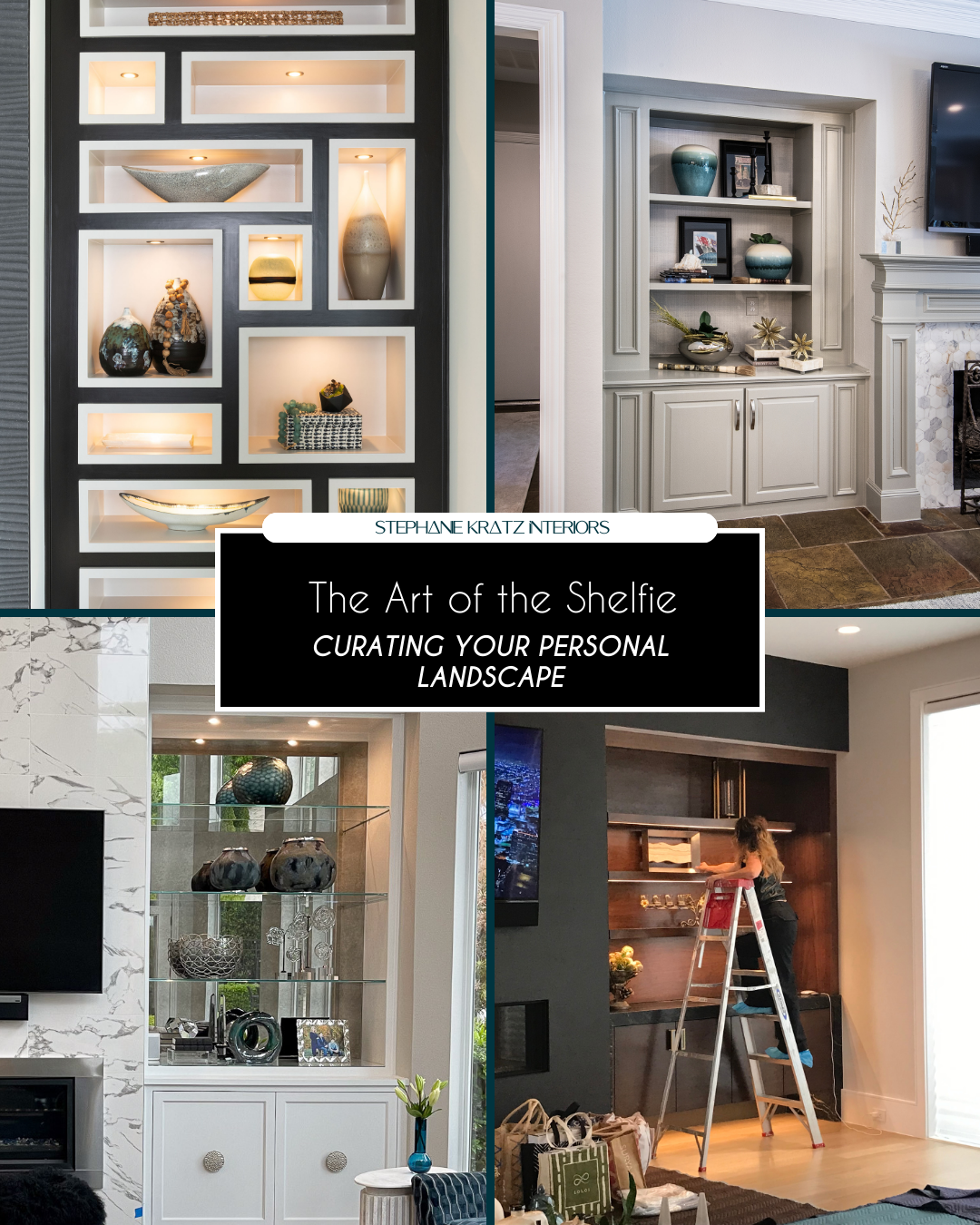
The Art of the Shelf

Stephanie Kratz • April 22, 2026

Estimated Read Time: 3-4 minutes


Key Takeaways:

  • Shelves are for curation, not just storage. Use "white space" to let your favorite pieces breathe and keep the room feeling airy.
  • Combine vertical books with horizontal stacks and sculptural objects to create a dynamic, balanced landscape.
  • Mix large scale statement pieces with smaller textures to prevent your built-ins from looking cluttered or "busy."

Curating Your Personal Landscape


A big, empty shelf can feel a bit overwhelming when you are trying to make a room look high end. If you don't think about what you’re doing, it can quickly turn into a messy drop zone for clutter. At Stephanie Kratz Interiors, we think of a shelf as more than just a place to put things; it is a chance to tell your personal story. We want to do more than just fill up the space. We want to create a "visual landscape" that helps people understand the style and the mood of the entire room.


3 Pillars of Art as an Architectural Investment


Achieving Balanced Composition

Styling built ins is all about Architectural Balance. Instead of seeing each shelf as another cubbyhole, we consider each shelf a point in a larger "Visual Landscape." In order to create a high end look, we must go beyond symmetry and balance and consider the idea of Visual Weight. This is achieved by placing a large, grounding organic stone sculpture on one side and a stacked book arrangement on the opposite side. Varying the heights and shapes of the objects creates a "Dynamic Narrative" that directs the eye around the space. It’s all about creating a sense of Design Permanence, as if each object was meant to be exactly where it is, contributing to the structural integrity of the space.


Mastering the 80/20 Rule

The most critical part of a Boutique Luxury design is knowing when to stop. We apply the 80/20 Rule to ensure there is "Room to Breathe" in the design. By designing the space to be 80% filled and 20% Intentional White Space, we provide visual relaxation and allow the architecture of the shelving to shine. The "Negative Space" is not wasted space; it is a design decision to ensure the cabinetry does not become a "clutter zone." This is part of what makes Meticulous Execution so critical.


Integrating High Touch Textures

In order to truly design a Sensory Sanctuary, you must go beyond the visual and enter the world of the tactile. We love Integrating high touch textures by combining elements with a sense of sensory contrast. For instance, you might pair a smooth, matte finish ceramic vase with the rugged edge of a piece of coral, or books with a vintage, leather bound finish with a shiny metallic accent. These tactile layers will shine differently in the light, and you will have Sensory Engineering at every level. By combining all these different finishes, you will give the house the 'Tactile Integrity' necessary to call it a high end home.


The shelving is what we are working with to make the room feel just right. It is all about finding that perfect balance between the architecture of your home and the lifestyle you lead. We love to mix materials like pairing smooth ceramic vases with old, leather bound books to create "Sensory Engineering" on every level. By layering your items and leaving room for the eye to rest, you turn a simple piece of furniture into a sophisticated design statement. It’s the final 10% of the room that truly makes it feel like a curated sanctuary.


Ready to turn your "blank" shelves into a curated design statement?

Contact Stephanie Kratz Interiors today for a free consultation!


Book A Consultation!

Share This Post

By Stephanie Kratz June 3, 2026
Estimated Read Time: 3-4 minutes Key Takeaways: Avoid a uniform showroom look by mixing chair tones and textures against the finish of your dining table. Pair substantial, fully upholstered end chairs with streamlined side chairs to eliminate a clattering "forest of legs." Reserve mixed seating arrangements for rectangular or oval tables, keeping circular tables uniform to protect symmetry. How to Build a Curated Dining Space with Intention Your dining area shouldn’t feel like a sterile showroom, mixing chair styles can turn it into a space that’s both cohesive and full of personality. Creating a beautiful and functional gathering area comes down to choosing the right chair combination. Because the dining room is one of the most high traffic spaces for hosting and family life, finding seating that complements your style and fits your layout is essential. How do you choose the right dining chairs, when should you mix and match seating, and how can you ensure your selections fit the scale of your table? Whether your home features an open floor plan or a more defined dining area, here are four practical strategies for mixing and matching dining seating to create a space that feels unified, inviting, and timeless. 4 Strategies for a Curated Dining Space Balance Tones and Materials The easiest way to establish visual balance is by looking at how the chairs interact with the finish of the table itself. If you have a solid wood table, avoid using matching wood chairs. Instead, introduce a strong contrast to let the pieces stand alone. For example, pairing a rich wood grain table with leather or textured fabric side chairs creates a sophisticated, layered look. If you want to mix chair styles, a foolproof approach is to use solid upholstered chairs exclusively for the ends of the table (the captain's chairs). This grounds the setup, provides a clear visual anchor, and gives the eye a nice break from repetitive lines. Contrast Weight and Shape When mixing seating, pay close attention to the structural weight and the legs of the chairs. If your end chairs are fully upholstered and have a more substantial, chunky silhouette, keep the side chairs simple, thin, and streamlined. You want to avoid a "forest of legs" where every single piece is competing for attention. If your side chairs feature slender metal or wood legs, pairing them with a clean, slipcovered or fully upholstered end chair with a hidden frame eliminates visual clutter. Always pick an end chair with more substantial weight when mixing it with slender side chairs so the arrangement feels intentional, not random. Factor in the Surrounding Space Your seating choices shouldn't be made in a vacuum; the architecture and layout of the room should dictate your decisions. In an Open Concept: You must look at the kitchen and dining areas as one continuous landscape. If your kitchen counter stools are visible from the dining table, they need to speak to each other. If your counter stools are natural wood, consider introducing iron, black metal, or fabric seating in the dining room to create a sophisticated, connected flow without matching exactly. In Smaller Spaces: Be cautious with how many different materials you introduce. Stick to a tight palette—like a wood table paired with matte black side chairs and a clean matching bench. Incorporating a streamlined bench is a fantastic, minimalist solution for tighter spaces, offering flexible seating for larger gatherings while keeping the sightlines open. Let Table Shape Dictate the Style The shape of your dining table is the ultimate blueprint for your seating layout. As a general rule, circular or round tables call for a continuous, uniform look. Mixing chair styles around a round table can quickly feel chaotic and disrupt the room's symmetry. Mixed and matched seating works beautifully on rectangular or oval tables, which naturally leave room for switching up the side and end chairs. To achieve a classic meets modern vibe, pair simple side chairs without arms alongside commanding end chairs with arms. If you want to refresh your existing space without a complete overhaul, simply swapping out your two end chairs for something texturally distinct can instantly breathe new life into the entire room.
By Stephanie Kratz May 27, 2026
Estimated Read Time: 3-4 minutes Key Takeaways: Transition to Light Linens to add movement and breeziness to your indoor-outdoor flow. Focus on Expanding the Architectural Horizon by blurring the lines between your lounge and your patio. Use Atmospheric Engineering to manage the increased natural light and keep your home a cool, restorative retreat. Transitioning Your Home for the Warmer Months As the Texas sun begins to intensify, your home should transition from a cozy winter retreat into a breezy, Summer Sanctuary. At Stephanie Kratz Interiors, we believe in "Seasonal Fluidity" the ability of your home to adapt its Atmospheric Engineering to the time of year. Transitioning for summer isn’t about redecorating; it’s about shifting the Tactile Integrity of your space to reflect the light, energy, and openness of the season. 3 Essentials for a Restorative Summer Home The Breezy Fifth Wall As we head into May and June, we swap heavy velvets for light, Belgian linens. This is about Expanding the Architectural Horizon; lighter fabrics catch the summer breeze and move with the air, adding a sense of "Organic Modernism" to your windows. Light filtering sheers allow you to maintain privacy while letting in that soft, minimally stimulating summer glow. Blurring the Social Sanctuary Lines In the summer, your patio should feel like a direct extension of your living room. We focus on Spatial Integrity, ensuring the furniture layouts and "Visual Anchors" outdoors mirror the sophistication of the indoors. By using performance fabrics with "High-Touch" textures, your outdoor lounge becomes a seamless part of your home’s Personal Narrative. Cooling the Sensory Palette Summer design is about Sensory Engineering to keep the mind cool. We look for "Material Honesty" in cooler tones think matte whites, soft grays, and natural stone surfaces. By reducing visual clutter and emphasizing "Intentional White Space," you create a low stimulus environment that feels like a cold glass of water on a hot day.
By Stephanie Kratz May 20, 2026
Estimated Read Time: 3-4 minutes Key Takeaways: Treat tile as Architectural Jewelry, it should define the room’s texture and scale. Prioritize Tactile Integrity by choosing tiles with physical depth, like hand-glazed zellige or etched stone. Use custom layouts to create a Visual Anchor that breaks the "expected" grid of a room. The Art of Custom Curation Tile is often treated as a functional afterthought, but at Stephanie Kratz Interiors, we view it as a primary medium for Atmospheric Engineering. When we talk about "Tile Designs with Soul," we are referring to the shift from mass-produced surfaces to the Meticulous Execution of custom stone and ceramic work. The right tile doesn’t just cover a wall; it provides the "High-Touch" definition that transforms a bathroom or kitchen into a restorative sanctuary. 3 Pillars of Soulful Tile Design Expanding the Architectural Horizon with Layout True luxury is found in the unexpected. Instead of standard offsets, we utilize "Design Logic" to create custom layouts that guide the eye. Whether it’s a vertical stack to add height to a shower or a bespoke mosaic in an entryway, manipulating the grid provides a sense of Design Permanence that makes the installation feel like a structural part of the home’s architecture. The Tactile Revolution In 2026, design is about what you feel. We prioritize tiles with Sensory Dimension hand clipped edges, undulating glazes, and physical textures that catch the light. When these "High-Touch" surfaces interact with your lighting plan, the room begins to breathe. This is Sensory Engineering that softens hard lines and adds a layer of "Organic Modernism" to your most intimate spaces. Material Integrity in Every Detail We urge our clients to invest in Material Honesty. Hand fired clays and honed natural stones have a "Soul" that mass produced porcelain lacks. These materials patina over time, contributing to the Spatial Integrity of your legacy home. It’s the final 10% the grout color, the hand-finish, and the deliberate curation that makes the design statement truly yours.
More Posts